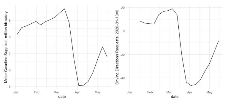
Gasoline Demand and US Mobility
Apple and Google have released data drawn from cell phone usage as proxies for compliance with stay-at-home orders. The Apple data is a measure of the change in requests for directions to Apple Maps, by driving, transit, and on foot. The Google data reports the relative change in visits to retail, grocery/pharmacy, parks, etc. Helpfully, they have been combined, and their data format has been standardized by GitHub user ActiveConclusion.
These datasets came to mind recently when I was looking at the recovery in gasoline consumption in the US as stay-at-home restrictions have been relaxed (see plot above). I was curious what the relationship between the Mobility data and Gasoline consumption would actually be. Obviously, we know that there is a connection, but how complete is the mobility data? In order to find out, I ran a simple regression model of Total US Driving Index from Apple on Motor Gasoline supplied from the EIA. (full code and results below)
Fitting a model to the two series (I’m just exploring here, so don’t anyone get wound up about the lack of sophistication of this model) indicates a very strong relationship–changes in the mobility index explain 84.2% of the changes in gasoline supplied on a weekly basis, and each one point change in the Mobility Index results in a 0.8% change in gasoline usage. These results are also very highly statistically significant. What is the practical implication? As Apple is releasing its data each day, whereas the EIA data is released only weekly, with a five day lag (each Wednesday’s release is for the week ended the previous Friday). Using this quite simple model, it would permit an analyst to create potentially more accurate forecasts of gasoline consumption ahead of the EIA release each week.
Regression Results for the model ln(gasoline) = b_0 + b_1 * driving + e


